which type of chart is preferable when you are dealing with a timeframe?
Which type of chart is preferable when you are dealing with a timeframe?
Answer:
When dealing with a timeframe, certain types of charts are particularly effective for visualizing changes over time. Here are some of the most preferable charts for such purposes:
-
Line Charts
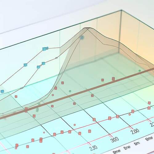
- Explanation: Line charts are one of the most commonly used types of charts for displaying data over time. They are excellent for showing trends and patterns.
- Usage: Each point on the line represents data at a specific time interval, and the connection of these points with a line helps visualize the overall trend.
- Example: Tracking a company’s stock price over a fiscal year would be effectively visualized using a line chart.
-
Bar Charts
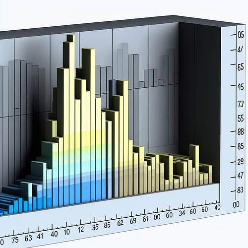
- Explanation: Bar charts, especially vertical bar charts, are also useful for showing data over time. They provide a clear comparison of different time intervals.
- Usage: Each bar represents a specific time period and the height of the bar represents the value of the data point for that period.
- Example: Monthly sales figures for a retailer can be shown using a bar chart to compare each month’s performance.
-
Histogram
- Explanation: A histogram is a type of bar chart that shows the frequency of data points within specified ranges. It’s particularly useful for showing distributions over time.
- Usage: Useful for displaying data in intervals (e.g., the number of transactions grouped by day or week).
- Example: The frequency of customer visits to a store throughout different times of the day.
-
Gantt Charts
- Explanation: Gantt charts are specifically designed to show tasks or activities over time. They are extensively used in project management.
- Usage: Each task or event is displayed as a bar spanning the timeframe during which the task occurs.
- Example: Project schedules with task dependencies can be effectively managed using Gantt charts.
-
Candlestick Charts
-
Explanation: Candlestick charts are primarily used in financial markets to represent the price movements of securities, derivatives, and currencies over time.
-
Usage: Each candlestick represents a specific time period and shows the opening, closing, high, and low prices.
-
Example: Daily price movements of a stock can be analyzed using a candlestick chart.
-
-
Area Charts
- Explanation: Similar to line charts, but the area between the line and the x-axis (time) is filled with a color, making it easier to see the magnitude of changes over time.
- Usage: Useful for showing cumulative or aggregated data over time.
- Example: Cumulative revenue growth over several years can be represented using an area chart.
Final Answer:
For visualizing data over a timeframe, line charts are generally the most preferable due to their simplicity and effectiveness in showing trends over periods. However, the choice of the chart type should be guided by the specific nature of the data and the context in which the information is presented.
Additional visualizations, such as bar charts, Gantt charts, and candlestick charts, offer specialized views that can also provide valuable insights depending on the application.

